Press

Does this sound familiar? You’re on your way to the office and you want to stop to grab a coffee, but the line is way too long . Many coffee shops partner with an order-ahead app, however, it can be time consuming to filter and sort through the abundant number of options. Press is a mobile application designed to simplify your morning routine by offering only the best coffee and tea beverages for pick-up.

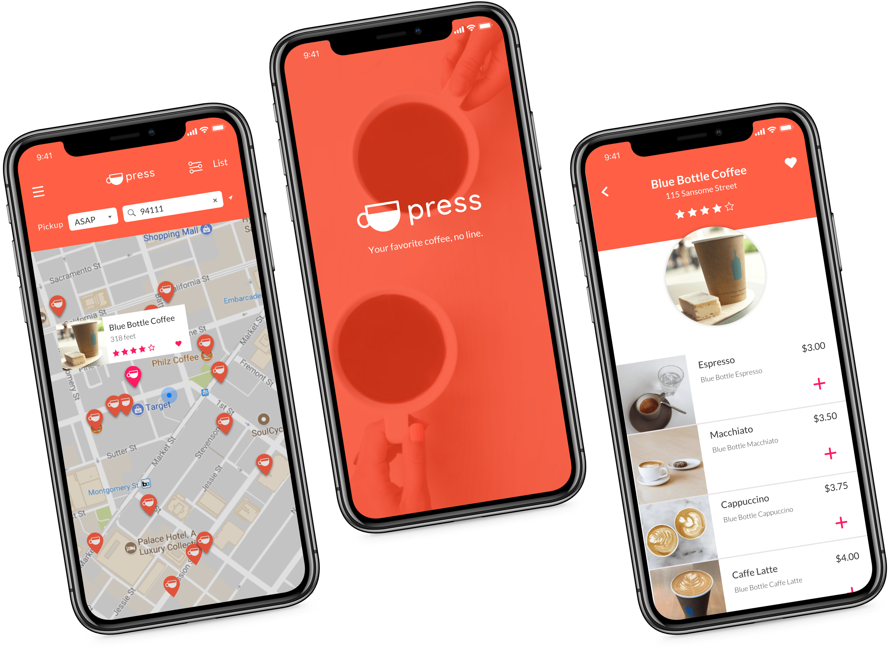
Preview of Press app

Roles

  • UX Design
  • Visual Design
  • Brand & Identity

Deliverables

  • User Interviews & Surveys
  • Competitive Analysis
  • User Stories & Flows
  • Brand & Identity
  • Wireframes & Mockups
  • User Testing & Design Iterations

Tools

  • Adobe Illustrator
  • Sketch
  • InVision
  • Flinto
  • UsabilityHub
  • Iterate

The Problem

talk bubble icon

Current order-ahead options focus primarily on food menu items. There is currently no app that focuses solely on coffee and tea beverages.

talk bubble icon

The Solution

Press was designed to help users quickly and easily order coffee and tea for pickup. By using familiar map, list, and search features, users feel comfortable navigating and placing orders.

Discovery

This project began with a brief to design an application that allows users to discover nearby food trucks, view a menu, select items for purchase, and checkout. Additional required features were to view previous transactions and leave a review. After a competitive analysis and user research, I discovered this solution exists in many formats. However, when I asked users what order ahead problem they would like to solve, the majority complained about the process for ordering coffee. After digging deeper into their issues, I decided to pursue a different path for the project and design a checkout process for this niche audience.


I began the discovery phase by researching the structure, design, and features of current order-ahead apps. Research confirmed that there are currently no applications that focus on coffee and tea beverages for multiple stores. Press should offer a familiar interface by offering a map view, list view, filters, search, and reviews. Research also uncovered that there was an opportunity for Press to stand out by offering curated images of items and a incorporating a feature that shows available locations based on a specific pick-up time.


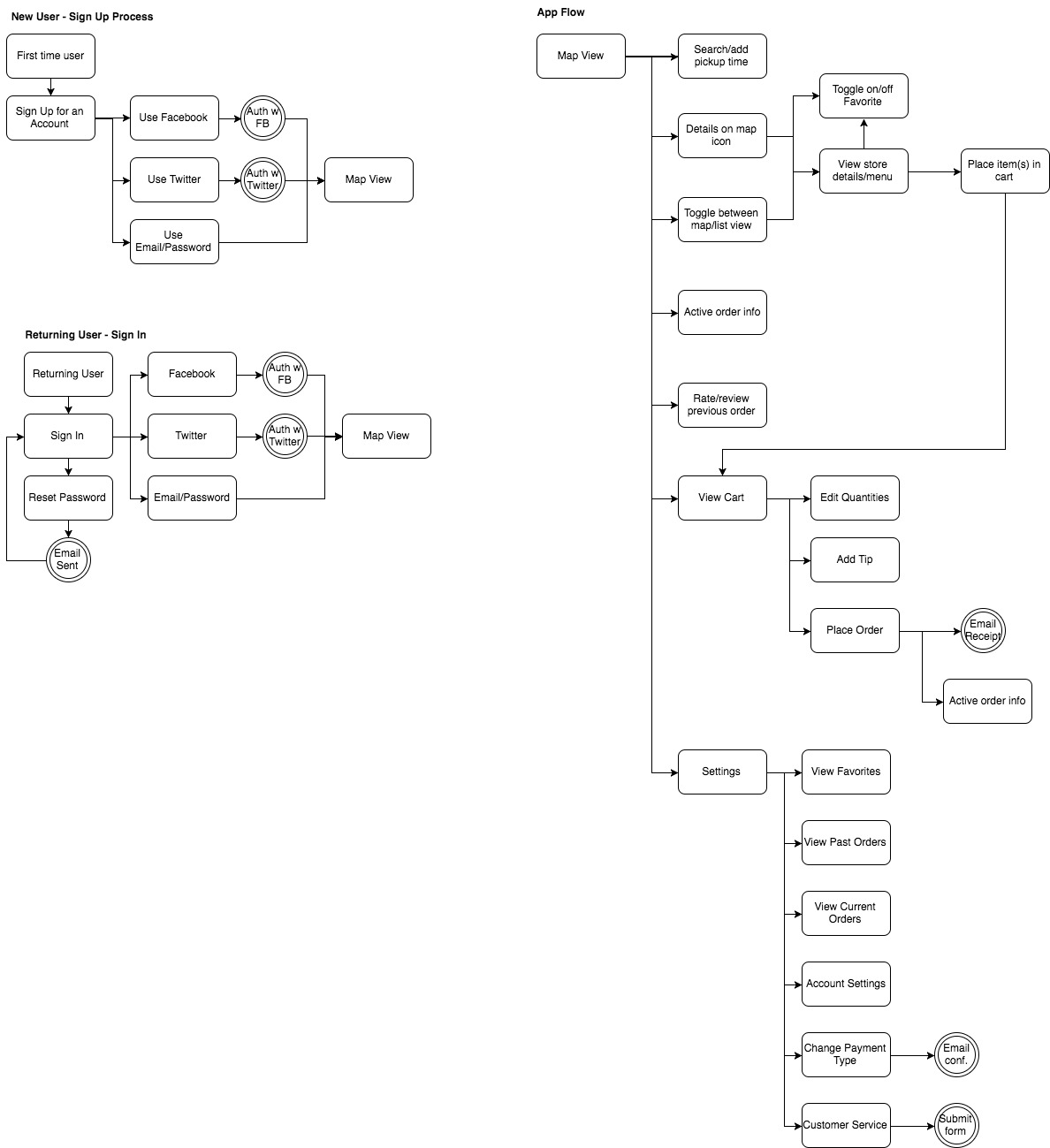
After crafting user stories to ensure all project requirements and user needs were met, I created user flows for the sign in/up and ordering process.
Press user flows

Visual Design

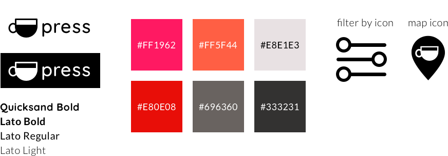
I created a styleguide for Press, choosing vibrant colors to stimulate the appetite and decision making. The main typeface (Lato) is both warm and serious, lending a trustworthy feel to the application.


Press styleguide

I used Sketch to create mockups for Press and used an InVision prototype to informally test the app with several potential users. Based on feedback, I included more prominent plus and minus icons next to the number of selected items. Because the majority of our potential users plan to use the app when they are rushed in the morning, adjusting items in the cart quickly with minimal effort is a priority. I also re-worked the tip selection design to minimize confusion. These changes were important for users to be able to complete the checkout process without error and efficiently continue their day.


Conclusion

Press is designed for commuters and busy coffee/tea drinkers that have a short time to place an order and grab a pick-me-up. The application achieves this quick transaction process by incorporating a pick-up time option on the main screen and utilizing common practices found in order ahead apps. Users will immediately be comfortable using the application.