Habit

Preview of Habit app and marketing site

Roles

  • UX Design
  • Visual Design
  • Brand & Identity
  • Front-End Web Development

Deliverables

  • User Interviews & Surveys
  • Competitive Analysis
  • Personas
  • User Stories & Flows
  • Brand & Identity
  • Wireframes & Mockups
  • User Testing & Design Iterations
  • Final Responsive Prototype & Web Marketing Site

Tools

  • Adobe Illustrator
  • Sketch
  • InVision
  • Flinto
  • UsabilityHub
  • Iterate
  • HTML, CSS & JavaScript
  • GitHub

The Problem

talk bubble icon

It’s safe to say that most of us habitually check our phones for alerts, for browsing social media, and everything in between. That screen time adds up, and many of us are seeking out ways to be more mindful. Habit was created to be a non-intrusive solution for anyone looking to track their app use.

talk bubble icon

The Solution

User research and competitive analysis results show an opportunity for Habit. Habit should offer the ability to customize which apps are tracked, indicate number of app opens, and show total amount spent within apps (such as food delivery or rideshare services). Users will use Habit to achieve a variety of goals from spending less time on social media to maintaining boundaries or saving money. Because of this, the design and experience of Habit should be welcoming and simplistic so users can quickly customize the app based on their desired outcome.

Discovery

Habit is a personal project I led from start to finish with guidance from a mentor. After the initial idea was concepted, I began with a competitive analysis and user survey. This research showed an opportunity for Habit, so I moved forward developing user personas, the foundation of the app’s design and features.


Users had a variety of goals they wanted to achieve: being mindful of time spent on social media throughout the day, maintaining current boundaries, and being attentive to money spent on apps. When creating user stories, each goal was given attention and incorporated into the design. User flows also reflected these goals, and outlined a structure for users to easily navigate the app.

Habit user flows

Visual Design

Habit sketch, wireframe, and mockup side by side

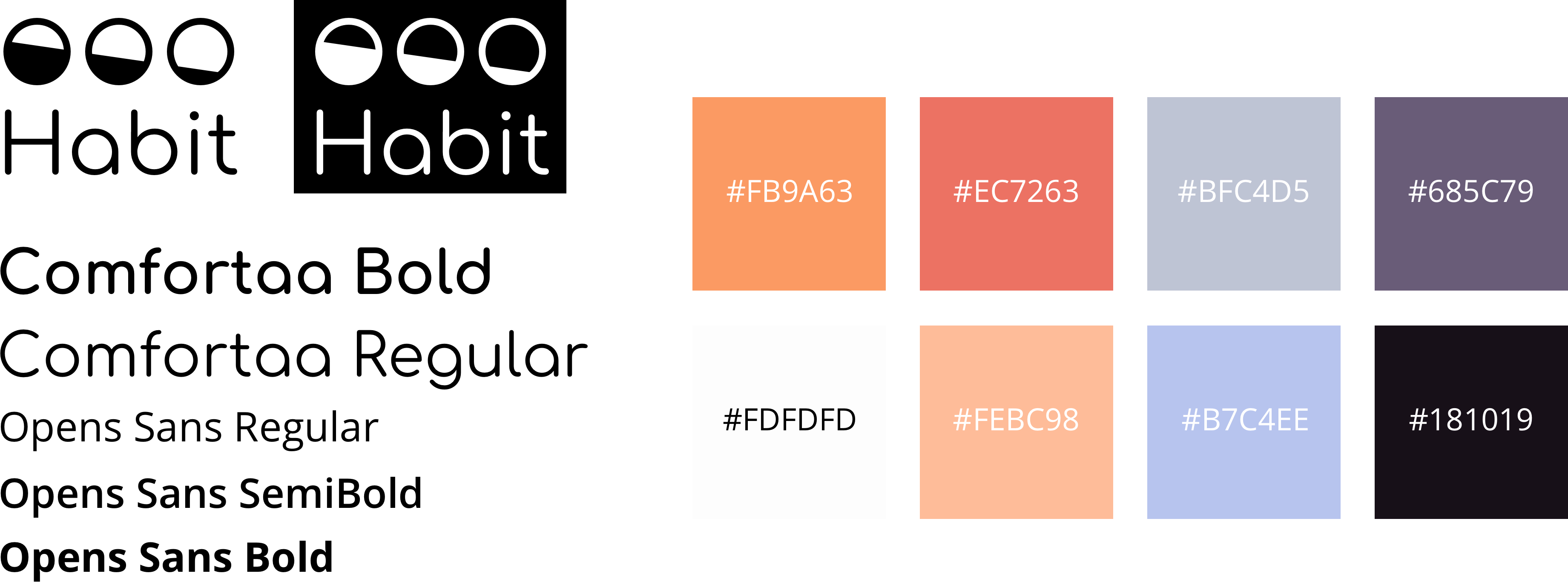
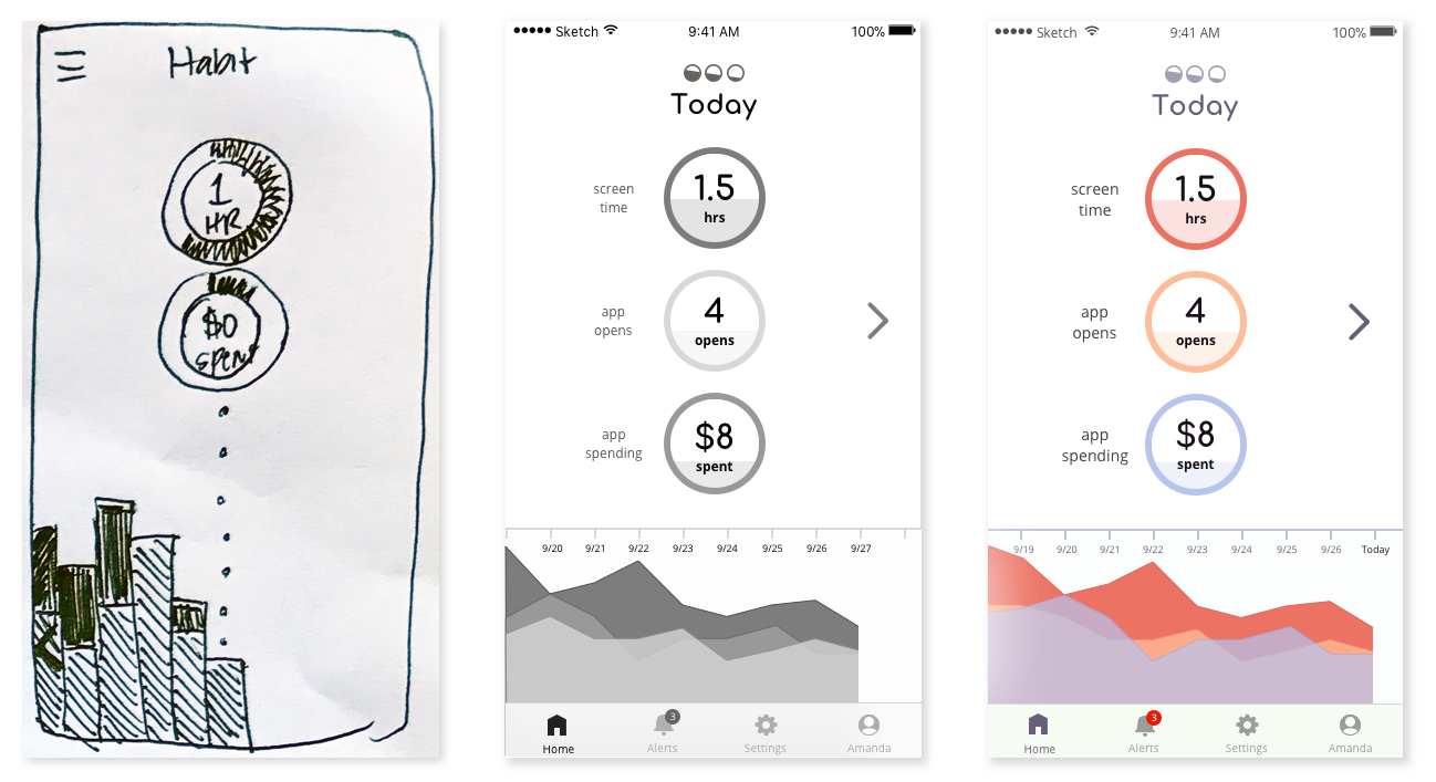
As I was beginning on wireframes for Habit, I also developed a brand and style guide. The logo represents the decrease of time and money spent on apps (the main goal of Habit) and the three buckets of information we’ll be summarizing for users - time spent on apps, number of app opens, and total money spent. For typography, I used Comfortaa for its geometric design and Open Sans for its humanistic characteristics that give the design a friendly feel. I wanted the color pallette to be fresh, warm, and calming and was drawn to colors that reminded me of a sunset and maintaining balance.


Habit styleguide

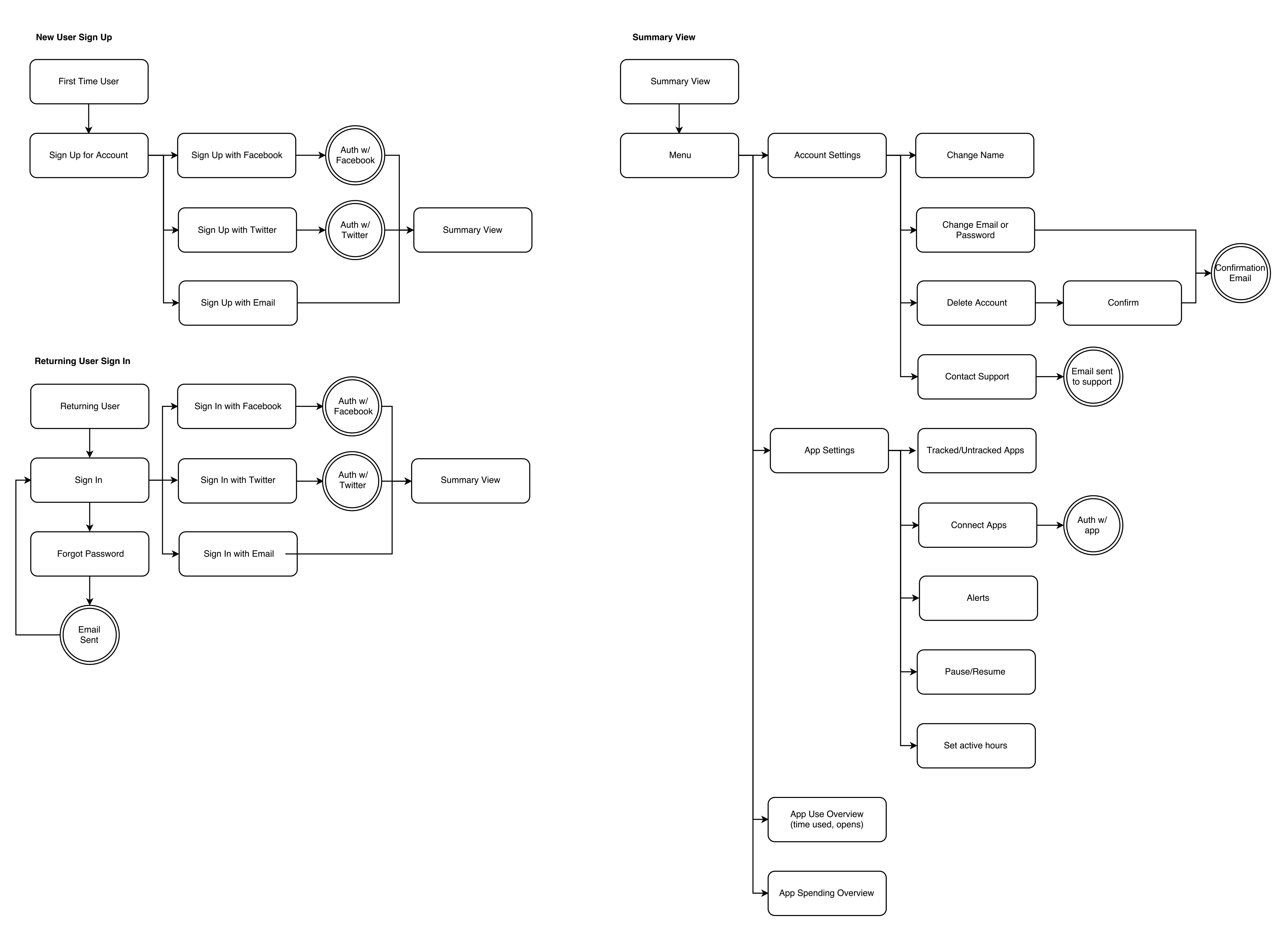
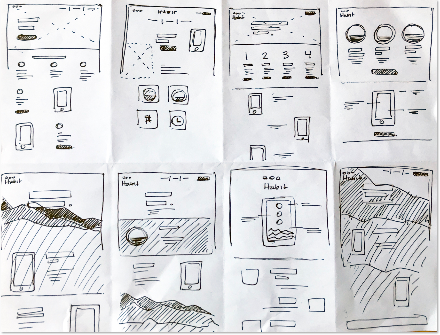
I took elements from sketches and created wireframes based on user flows. I began with designing an easy to interpret summary screen. With mentor guidance, I made edits to wireframes before incorporating the full visual style into a mockup. Main edits included adding clarifying text and adjusting spacing.


I created mockups in Sketch, utilizing the color pallette to help users keep track of stats throughout the app. Mockups went through several rounds of user feedback and testing. Through user testing, I learned that some did not realize goal setting was an option. Based on this information, I incorporated goal setting into an onboarding process. User testing also lead to fine tuning placement of the timeline and re-grouping items in account settings. After these changes, Habit was more user-friendly and intuitive.


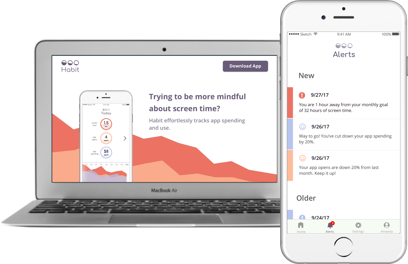
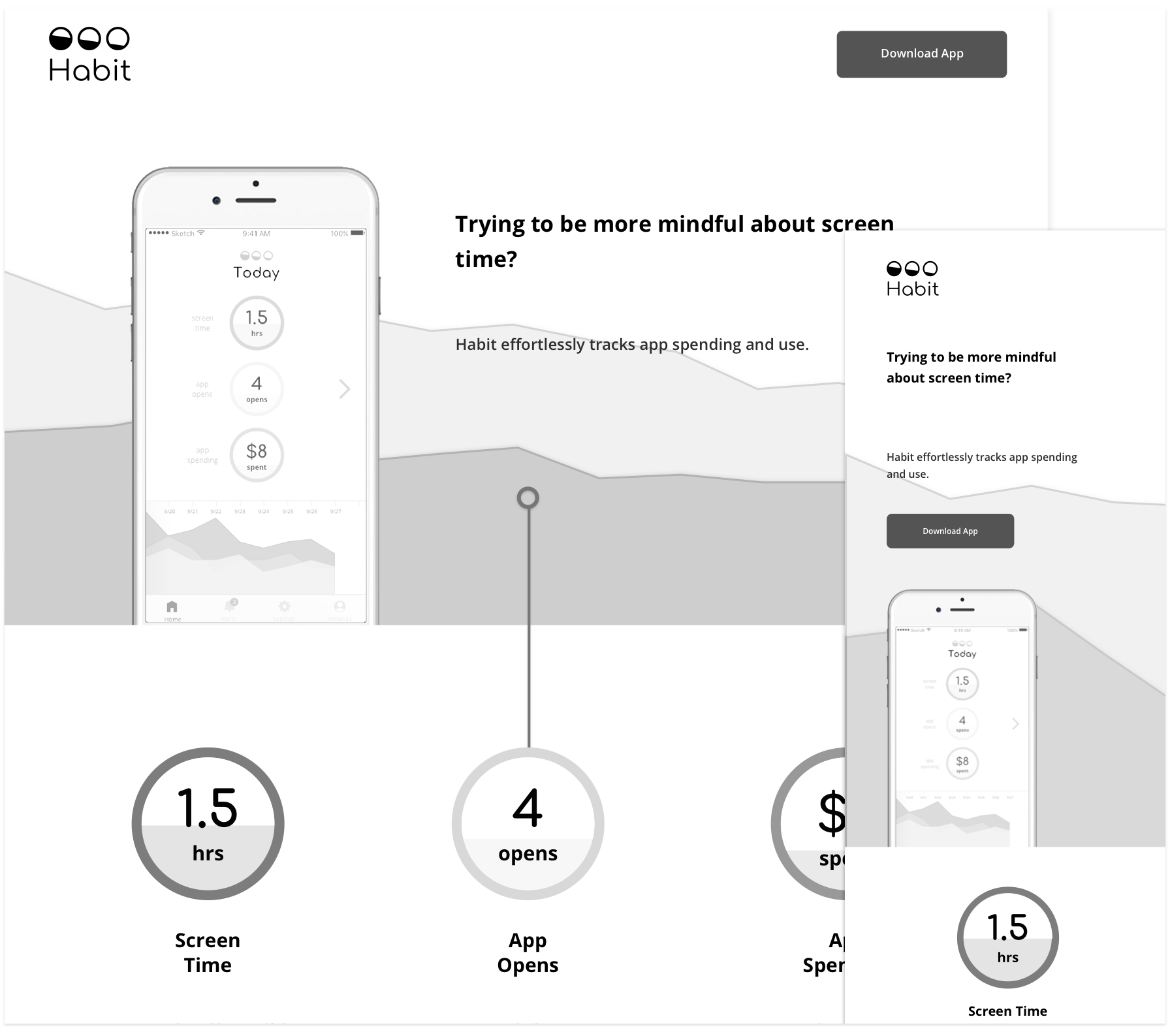
The last step in this project was creating a responsive marketing web page design for Habit. I followed the same process: sketching, wireframing, and adding the visual style. I then used HTML, CSS, and JavaScript to create a fully responsive web page that replicated the hi-fidelity prototype created in Sketch.


Habit web sketch page

Habit web responsive wireframe

Conclusion

The completed Habit prototype has a simple, easy-to-navigate interface that is customizable for the variety of user needs being met. I discovered that the simplicity resonated with users, and they found it helpful to see the stats presented in a variety of ways. The challenge for me was keeping the design uncluttered and uncomplicated, while also giving enough context so users could understand the information.